From SportsBusiness Journal – Feb. 23, 2004
“Loyalty to any one sports team is pretty hard to justify. Because the players are always changing, the team can move to another city, you’re actually rooting for the clothes when you get right down to it. You know what I mean, you are standing and cheering and yelling for your clothes to beat the clothes from another city.” – Jerry Seinfeld
By Pete Williams
Since Seinfeld’s 1995 monologue, more than half the teams in sports have changed their clothes. More specifically, they’ve engineered radical changes to their “marks,” the logos and uniforms that these days contribute more to a sports franchise’s brand identity than the players wearing them.
The trend does not include the countless uniform tweaks, the creation of secondary logos, the additions of alternate caps, third jerseys, batting practice gear, or the occasional wearing of “retro” uniforms – all of which leads many fans to believe the entire process is just a shameless ploy to sell more merchandise.
But behind the bulging racks of jerseys is a strategy based not on merchandise sales but on re-branding a sports property to keep up with the team’s ever-changing fortunes and reposition it in a crowded marketplace.
Because of constant player turnover and parity across the four major sports, it’s never been more difficult to build a dynasty, and thus a sports brand with a lasting reputation for success. Yet those same factors, along with the stadium building boom and frequent ownership turnover, have made it easier and more commonplace for a franchise to re-invent itself as a brand than ever before.
Still, clubs cannot implement new marks haphazardly. Each of the four major sports leagues requires 18 to 24 months for research, fan focus groups, design and a launch schedule that gives licensees plenty of time to sell old inventory.
“You never want to change for the sake of change,” says Scott Carmichael, the NHL’s director of club marketing. “Fans invest in the game emotionally and financially and you don’t want to alienate them with a new logo or uniform. That’s why there’s a very sophisticated process that teams must go through.”
Leagues oversee the process, in part to make their own resources available but also to ensure that new marks are consistent with those throughout the league. There’s also the issue of how the new designs can be implemented across a wide range of licensed merchandise.
“You might have an intricate design that’s a thing of beauty,” said Christopher Arenas, senior director of apparel for the NBA. “But if it can’t be easily stitched onto a golf shirt, it presents a problem.”
Teams typically begin the process by soliciting fan input on their existing marks and return to focus groups throughout the design process for thoughts on proposed changes.
The Atlanta Falcons and Seattle Seahawks discovered that fans did not view their logos as representing the speed, focus and intimidating characteristics of their respective birds, let alone the desired traits of a football team.
The Seahawks, who re-branded prior to their move into a new stadium and a new conference in 2002, revised the logo to feature a slimmer, more aggressive bird. Green was virtually eliminated from the color scheme, replaced by “steel blue.”
The Falcons began their re-branding efforts after Home Depot co-founder Arthur Blank purchased the team late in 2001, introducing new marks before last season. The result was the first logo change since the team’s inception in 1966, with dark red and silver added. The logo also was tilted forward to create a sense of movement.
“We kept hearing from fans that they wanted to keep the identity, but wanted more color, excitement and fierceness,” said Falcons vice president of marketing Dick Sullivan. “In the end, it’s hard to go wrong with the customer consensus, though uniforms and logos are like music. Everyone has a different opinion.”
For all of the tireless attempts to create an imposing color scheme and a menacing logo that connotes speed and power, the image of a team’s brand ultimately depends on the product on the field, not on its marks.
After all, it’s unlikely an expansion or re-branding team would consider a green-and-gold color scheme with a generic lettered logo. Yet the Green Bay Packers marks are among the most valuable in sports because of the team’s storied history.
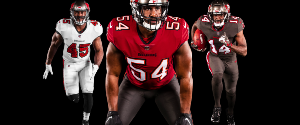
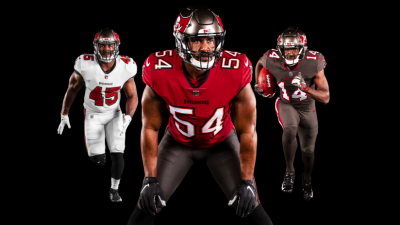
The Tampa Bay Buccaneers still might be wearing Popsicle orange with a winking Pirate logo if they had produced 10 winning seasons before 1997 instead of 2. The marks became identifiable with losing and financial underachievement and were overhauled completely after Malcolm Glazer purchased the team in 1996.
“You have to look at the identity of the franchise and determine if the marks are debits or credits to the balance sheet,” says Ryan Kaps, a Scottsdale, Ariz., designer and branding expert who has worked with Adidas and the NFL Players Association. “The danger in making a change is whether you’re sacrificing the historical identity of the club just to be trendy.”
“Most sports organizations are so focused on winning games and selling tickets that they don’t spend a lot of time on strategic marketing of the brand,” says Ed O’Hara, chairman of SME, Inc., a New York firm that has helped re-brand many sports franchises. “You have to consider the team, city, region and history – everything that makes up the essence of who you are.”
In re-designing a brand, teams must achieve a delicate balance. They need to incorporate past designs to maintain brand identity, especially those associated with success, while at the same time updating and refreshing the look to show change, growth and progression.
The idea, branding experts say, is to follow the lead of Coca-Cola’s subtle tweaking of its famous cursive logo every decade or so – not scrapping valuable brand identity altogether and ending up with New Coke.
“It’s no different than an item on the grocery shelf,” says Bill Gardner, a Wichita, Kansas, branding expert. “One of the quickest ways to improve your position is to re-brand and say you’re new and improved. Campbell’s Soup hasn’t changed. But since its can now has a picture of vegetables
instead of just a seal, there’s a subtle message that it’s somehow better.”
Like New Coke, the acceptance of a new logo and uniform has much less to do with the packaging than the product itself. Before the 2001-02 NBA season, the Detroit Pistons scrapped the teal, black, yellow and red color scheme of the previous five seasons (three losing) and returned to its original red, white and blue, a combination associated with its “Bad Boys” teams that won back-to-back NBA titles.
Fan surveys had called for the return. That wasn’t a hard sell for Joe Dumars, the team’s president of basketball operations and former Bad Boys shooting guard.
That same season, the Seattle Supersonics also responded to fans and returned to their green and gold roots, scrapping the darker green and copper palate they adopted just a few years earlier. To reinforce the connection to the team’s winning squads from the late 70s, the team brought back former players Jack Sikma, Slick Watts and John Johnson for the unveiling at a summer basketball tournament attended by thousands.
This year, the Houston Rockets and Cleveland Cavaliers responded to fan focus groups that called for a return to cleaner, more classic uniform designs and colors from their more successful eras.
Kiki Vandeweghe, general manager of the Denver Nuggets, wasn’t about to reinstate the rainbow color schemes he wore as a player in the early 1980s. No matter that those high-flying Nuggets regularly scored in the 140s wearing uniforms that now are among the hottest among “retro” collectors. Instead the Nuggets opted this season for a powder blue similar to what Vandeweghe once wore at UCLA.
The Nuggets considered re-designs of their 10-year-old primary logo before opting for a mere color change, along with a new secondary logo.
“We wanted colors that didn’t already exist in the league,” says Tom Philand, the Nuggets vice president of marketing. “This had a stand-alone quality we felt would stand the test of time.”
The Nuggets color change might seem like a radical departure. Then again, the league has received input over the years from the likes of Alexander Julian (Charlotte Hornets), Oscar-winning costumer designer Eiko Ishioka (Rockets), Jhane Barnes (Orlando Magic), Florence Griffith Joyner (Indiana Pacers) and P. Diddy, who will design the Dallas Mavericks’ alternate uniforms for next season.
“Usually, their ideas are not that different from our internal sports designers,” Arenas said. “People understand it’s a tank top and short. It’s not like they’re going to suggest a one-piece or something with long sleeves.”
For some teams, re-branding is all about re-connecting with the community, especially in cases where an expansion or honeymoon period is over.
Last summer (2003), the Magic introduced a 15th anniversary logo to go with a streamlined uniform design that accentuated the city name on the road uniform. The launch took place at city hall and coincided with a cover story on the new look in Orlando magazine.
Phoenix Coyotes officials leaned heavily on fans and focus groups to help re-design their marks as they headed into their eighth season in the desert after relocating from Winnipeg. The unveiling took place at a popular mall, with more than 3,000 fans on hand.
The San Diego Padres, who will christen the downtown Petco Park this spring (2004), created new marks that are more San Diego and less Padres. MLB designers focused on water, sky and sand hues, unveiling the new marks at a waterside press conference.
The Swinging Friar logo, which over the last decade inspired the “Keep the Faith” marketing slogan and the “Frequent Friar” fan card reward program, has been relegated to a patch on one of two home jerseys. The transition reflects the team’s move from one of the last remaining multi-purpose stadiums to a downtown ballpark inspired by the sand and sea.
“The true test is whether it’s impossible to put another team name in the new logo and be effective,” says Ann Occi, MLB’s vice president of design services. “That’s a key point with any re-branding.”
The Toronto Blue Jays, who introduced new marks in September, eliminated the distinctive maple leaf. That upset some Canadians, though even that move was done with the idea of re-connecting with a community.
“We wanted the brand to stand more on its own,” said Lisa Novak, the Jays senior vice president of business affairs. “People know we’re a Canadian club. We want to appeal to our fans from western New York and we no longer wanted to be thought of exclusively Canadian.”
The new logo, designed by Toronto-based Brandid, is the fourth in the Jays’ 27-year history. It includes a sleeker, more metallic look that departs from the more conservative previous designs.
More recent expansion teams tend to become more conservative as they age. The Magic and Coyotes, like many new or relocated franchises, overdid it on initial logo and uniform design, creating busy marks with too many colors and features. The Magic scrapped their Globetrotter-like stars for this year while the Coyotes shed colors to produce a classic look that vice president of marketing Brett Rogers says “can stand the test of time.”
“As a franchise matures, you want the uniforms to have a more mature look,” said Chris D’Orso, the Magic’s vice president of marketing. “You can’t go wrong with a clean, classic design.”
Some newer teams don’t wait long to re-design. The Baltimore Ravens changed from a “shield” logo to more of a bird design after just three seasons. The Tampa Bay Devil Rays also overhauled their marks after three seasons, placing a greater emphasis on green and a more streamlined “Rays” moniker before the 2001 season.
“Until you’ve actually put (marks) into use, you don’t get a good feel for how they might be improved upon,” said Rays senior vice president John Higgins. “There’s nothing that says you have to wait five or seven years to make a change.”
Cost does not seem to be an issue. The leagues and their licensing arms bear much of the expense and even when teams enlist their own branding and design agencies, the bill rarely exceeds $150,000. Since new marks often coincide with new stadiums, it’s actually cost effective to make a change before the move.
“You’re going to plaster that new logo everywhere,” Rogers says. “If you decide to make a change two years later after you move in, that’s a significant expense.”
Leagues and teams typically solicit input from uniform manufacturers and the players themselves in the re-branding process, though that often involves the function of the uniform rather the look. An accent strip of fabric on an NBA jersey around the arms or neck might be abrasive.
“Guys are concerned more with if a new uniform will be heavier or fit differently,” says Brian Jennings, the NHL’s group vice president for consumer products marketing. “Those kinds of things can affect performance.”
Professional athletes are a notoriously suspicious bunch, adhering to rituals to maintain winning streaks and trying anything to snap out of slumps. Not surprisingly, re-branding almost always occurs with sagging franchises. Teams frequently see their fortunes reverse, though that often is more easily explained by new ownership or a new stadium and its accompanying revenue streams.
Then again, the Anaheim Angels shocked the baseball world by winning the World Series in 2002, nine months after adopting new marks and more than a year before Disney sold the team to Arturo Moreno. The San Antonio Spurs won an NBA championship last season, their first since scrapping the pastel “fiesta” colors included in their logo throughout most of the David Robinson era.
Some fans of the Denver Broncos expressed disappointment over the team’s radical logo and uniform re-design in 1997, at least until the team broke a long stretch of Super Bowl futility and won the first of back-to-back titles.
Between 1996 and 2000, seven of the eight NFL teams to change their marks reached the playoffs in their first season with the new look. The 2000 New England Patriots did not, but have since won the Super Bowl twice. (The trend ended in 2002, with the Redskins, Bills and Seahawks finishing with losing records.)
Sometimes an unforeseen turnaround causes a team to table a re-branding effort. Officials from Palace Sports & Entertainment, which purchased the long-struggling Tampa Bay Lightning in 1999, began exploring a re-branding early in 2002. Designs were submitted, many featuring palm trees and other Florida themes.
That fall, the Lightning became the surprise team of the NHL, later winning the Southeast Division and carrying the success into this season. Re-
branding has been placed on the backburner
“It’s still something that we’d like to get done at some point,” says Lightning senior vice president Bill Wickett. “But it’s usually not something you mess with when your popularity is on the upswing.”
Since re-branding is a lengthy process, it’s difficult to time the launch of new marks with a turnaround on the field or the arrival of a new player that injects life into a franchise.
Other times, the moons align perfectly. The Los Angeles Kings had a silver-and-black re-branding in the works for more than a year before Wayne Gretzky’s surprise acquisition from the Edmonton Oilers in 1988. Likewise, the NBA’s Cavaliers and Nuggets were plotting new marks long before their 2002-03 struggles made them the favorites to win the NBA draft lottery and select popular youngsters LeBron James and Carmelo Anthony, respectively.
Measuring the success of a re-branding is difficult to quantify, especially since it often coincides with new administration, new arenas and roster turnover. Since all four major sports leagues share licensing royalties equally, it matters little to individual teams when their merchandise soars to the top of league sales rankings, though teams enjoy the added retail revenue from their own stores and stadium shops. Even then, teams are left to wonder if it’s the new marks or the popularity of individual players driving sales.
Some fans and designers criticized the Falcons for the more cluttered uniform design unveiled before last season. That didn’t stop fans from buying jerseys and goods depicting Michael Vick, who though injured much of the year remained the league’s top seller.
Like the Falcons, the Cavaliers have struggled in their first year of re-branding, though James has rekindled national interest in Cavs merchandise. Or could it be because of the attractive “wine and gold” color scheme?
“I’m sure it’s a little of both,” says Cavaliers president Len Komoroski. “But I’ve yet to hear a fan say they don’t like the new look. At least anecdotally, that indicates the re-branding has been successful.”
Of course, a team’s fortunes on-field and financially dictate the lasting success of a re-branding. All the re-launch talk of streamlining, modern color palates and re-connecting with the community mean little unless on-field success follows.
The nation’s capital epitomizes the struggle. The NHL’s Capitals new marks were well received in 1995 and the team reached the Stanley Cup Finals for the first time two years later, its first in the MCI Center. The NBA’s Bullets became the Wizards for 1997-98, but not even a new arena and Michael Jordan could turn around the long-struggling team. Both franchises again appear in need of re-branding.
No wonder then that Trevor Hoffman, the longtime San Diego Padres reliever, tempered the enthusiasm of the team’s re-branding, even as he praised the new uniforms during a November press conference.
“People are going to have their say and talk about what they like or don’t like,” he said. “Ultimately, it’s the way we play on the field that’s going to make any uniform look good.”